Tuesday, September 19, 2006
ED goes Advertising 2.0
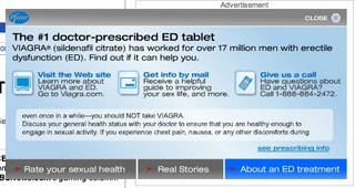
As much as I dislike the continued bombardment of Viagra and related drugs, I'd like to focus today on a well-developed banner ad for one such drug. 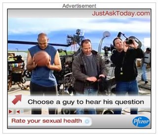
Despite the email notices to the contrary, Viagra is a prescription drug and cannot be sold directly online. Therefore, the ultimate goal of any online advertising is education and awareness to move the viewer to ask their doctor for a prescription.
So, why not employ some Advertising 2.0 philosophy and take the message to the viewer rather then require the viewer to click-thru to a micro site. I'm sure some viewer's whom might want to research the drug may not click-thru for fear of history and cookie trails.
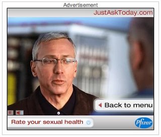
Anyway, this banner includes about 10 original video clips designed to answer viewer questions. The video puts a 'face' on the problem and allows the viewer to interact with these personalized responses. The opening video is an introduction that sets the stage for three "average men" to ask questions. Each person is hot-spotted to lead to his particular video question. While they "are waiting" to be clicked upon, each guy is independently moving with audio calls to action.
Additionally, there are video testimonials - real people talking about their experiences.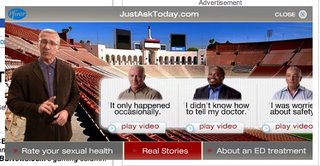
The banner also includes a self-test with 5 easy multiple-choice questions. The result provides suggestions including visiting a doctor.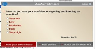
The only issue I have with this banner is the expansion, which I don't think adds enough to justify the additional media costs. But, that aside, this is a deep, focused and engaging banner that uses multiple content types to guide the viewer to a conclusion and action. All without requiring a click-thru.

Despite the email notices to the contrary, Viagra is a prescription drug and cannot be sold directly online. Therefore, the ultimate goal of any online advertising is education and awareness to move the viewer to ask their doctor for a prescription.
So, why not employ some Advertising 2.0 philosophy and take the message to the viewer rather then require the viewer to click-thru to a micro site. I'm sure some viewer's whom might want to research the drug may not click-thru for fear of history and cookie trails.
Anyway, this banner includes about 10 original video clips designed to answer viewer questions. The video puts a 'face' on the problem and allows the viewer to interact with these personalized responses. The opening video is an introduction that sets the stage for three "average men" to ask questions. Each person is hot-spotted to lead to his particular video question. While they "are waiting" to be clicked upon, each guy is independently moving with audio calls to action.

Additionally, there are video testimonials - real people talking about their experiences.

The banner also includes a self-test with 5 easy multiple-choice questions. The result provides suggestions including visiting a doctor.

The only issue I have with this banner is the expansion, which I don't think adds enough to justify the additional media costs. But, that aside, this is a deep, focused and engaging banner that uses multiple content types to guide the viewer to a conclusion and action. All without requiring a click-thru.
